Let's take a walk through the whole house palette, shall we? I loved getting to choose the house colors all at once. I have lots of overall tips and info I'll share at the end of the post, but here's a quick rundown of the colors we used:
 |
| Benjamin Moore Seashell OC-120 |
I know this color doesn't look like anything special, but it can be really hard to find a good off-white. This one was recommended to me by my Mother-in-law when we painted the wood paneled living room in our old home. I loved it there, and so I figured, why not repeat it in this house? It looks great with any other color in a variety of light conditions. I'm not a big "white" or "beige" person, but when painting over wood paneling, I think this is the way to go. We also used it in both upstairs bathrooms, because it played well with the '70s/'80s vanity/linoleum/shower combos that were all in the beige and tan family:)
 |
| Here it is in the old 1961 Ranch house in Prairie Village |
 |
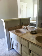
| In Charlie's bathroom |
 |
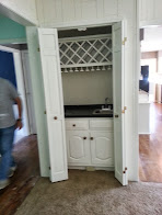
| Tough to find a good pic but it's on the paneling below the stairs |
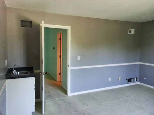
The next color I can't find an online swatch for, but it's a discontinued Sherwin Williams color called "Whisper Grey." I initially read about it in the now-defunct Domino Magazine about 7 years ago. I remember some New York designer or artist had painted their entire apartment and they raved about how the color worked against warm or cool tones for hanging art. I painted our entry hallway this color at our old house, and decided it worked so well, why not recycle it? We chose it for our Master Bedroom and Bathroom. Our old master bedroom was a dark grey, which I liked, but it was a little too dark, so this grey is a bit lighter. It really does look warm or cool depending on the light. Grey is really hot in interiors right now, so it's also on trend, but many of the ones are muddy or kind of "greige." I like the clean nature of Whisper Grey. Any Sherwin Williams can still mix it up for you, as can Benjamin Moore using the old formula.
 |
| Same color, different light |
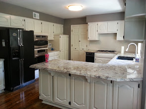
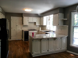
So, sticking with the greys for a minute, we chose a grey for the kitchen. We knew the unchangeable things were the hardwood floors and the newer granite countertops that had been installed before we purchased the house. We also decided to paint the cabinets rather than tear them out and replace them, which basically meant choosing a paint color for the cabinets. We also replaced the tile backsplash, since the stark black-and-white color didn't complement the countertops. We chose off-white trim paint for the cabinets and an off-white subway tile for the backsplash, so we didn't feel like white would be a good choice for the walls. (Too much white!) At the same time, although we love bright colors, the kitchen was a little different--we wanted something we could live with for a long time, and not worry about matching all our kitchen accessories to a bold color scheme. So, in a very uncharacteristic fit of sensibleness, we chose a grey neutral based on the countertop color, Benjamin Moore Baltic Gray 1467.
 |
| close-up of counters/tile combo |
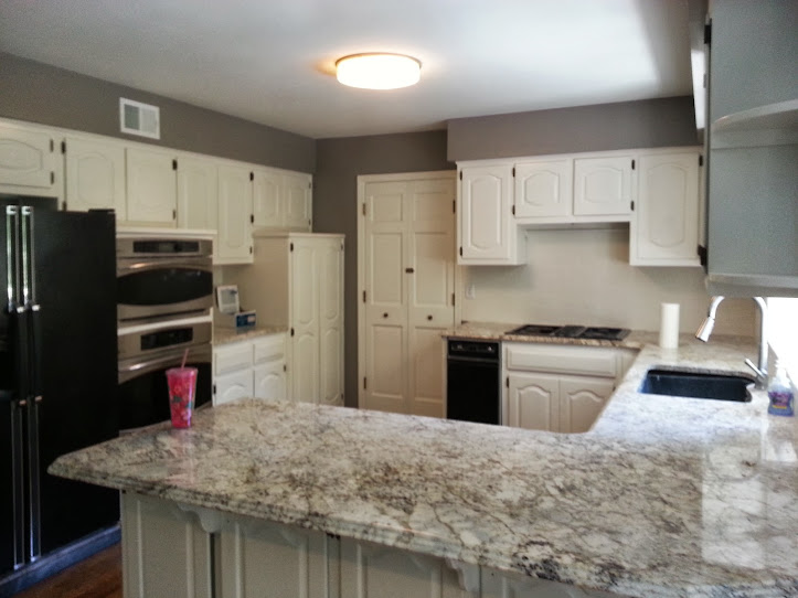 |
| kitchen with Baltic Gray |
When I got the chip from Benjamin Moore, they told me that was their most popular paint swatch right now. It shares a row with Willow Creek 1468, which ended up our color for the guest bedroom. They jokingly called these the "Mission Hills Grays" because of their popularity in home interiors right now. I have mixed feelings about neutrals, and trendy colors, but at the end of the day I like them, they work, and should wear well for a few years without needing immediate updating.
 |
| Willow Creek in the guest room |
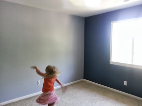
We had one more grey in the house, in Charlie's Star Wars-themed room, Silver Lining, 2119-60. With blue and grey walls, I'm hoping the colors will age well. After all, they can be Royals or Sporting KC themed later, or a more neutral "boy" kind of vibe when he outgrows Star Wars. (As IF--I still haven't outgrown it!)
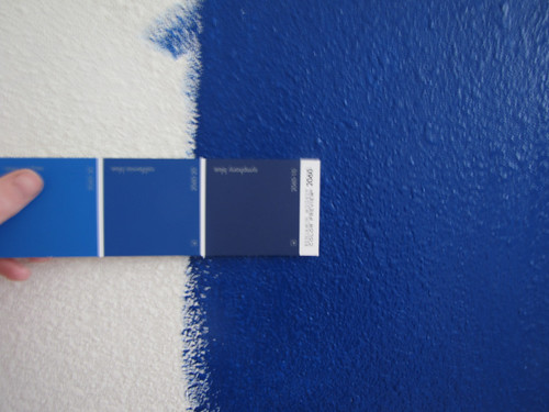
This moves us rather nicely to the blues. The blue in Charlie's room is Van Deusen Blue, HC 156. We also chose a blue for the dining room. I had rather a specific blue in mind; not quite Navy, not quite Royal. I think this Benjamin Moore Symphony Blue 2060-10 turned out perfectly! I am so happy with it, even if I did have to request the painters put another coat on. Apparently blues and reds are really hard to get good coverage on.

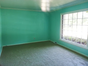
Now the FUN blues! Ian and I talked about the entryway, and we really wanted color and drama. In looking through interior design books together, we were both drawn to high-contrast entryways with lots of pattern and color, especially higher-end wallpapers. Since we knew the size and shape of our entry area would be a) terribly difficult to wallpaper and b) the wallpapers we like are nowhere near our budget, we picked paint.
I may have mentioned here before how much I love
Katie Ridder interiors, and she is an aqua/mint/blue junkie. We fell in love with her entryway of her personal home, pictured in her book,
Katie Ridder Rooms, which you should really check out at your local library. I initially went really light, but realized it would just look like white once it was on the walls. Why bother?! I went one intensity higher on the chip to Frosty Mint, 2043-70.
 |
| Frosty Mint |
 |
| I cannot wait to see how our art and stuff looks on these walls! |
 |
| Speaking of mint. . . |
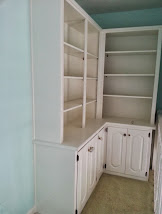
So, for the office, I dialed up the intensity a lot. This was for several reasons. First, this space will be separated by french doors, so the color in here didn't have to "flow" as well with the rest of the house. Also, this room will be used for tutoring, playing piano, and the kids completing their homework, so I wanted a bright, creative, stimulating space. Finally, remember our IKEA walls of bookshelves in our old living room? We had to leave those for the new owners, but we plan on covering two walls of this room with floor-to-ceiling bookshelves, covered up and toning down any color overwhelm in this space. Color is Summer Green, 2043-60.
Speaking of fun colors, there was never any question that Eloise's room would be pink. I tried to talk her into a subtle pink. Then we discussed a peachy pink. But she had a very definite opinion and since decorating her own room was the major bribe to get her prepared to leave our old house and be homeless for several weeks, I let her hand-pick Sweet 16 Pink from the paint store. She also wanted magenta, bright purple, and aqua blue, so this WAS the toned-down version!
 |
| Ian's lights look pretty good, too. |
There are so many resources out there on choosing paint colors that I don't feel I'll have any expert opinions on the subject to add. I will, however, summarize some approaches that are out there that worked for us:
1) Work with what you have. Check out existing finishes (such as flooring, countertops, and even large furnishings such as sofas, etc.) that will NOT change. Make sure you pick paint colors that work with them. It's easier and less heartache to paint to coordinate than change everything else in your house to match the new paint!
2) Start with what you love. I know all the theories out there on choosing colors from picking an inspiration swatch such as a photo, piece of art, scarf, swatch of fabric, to making them fit the era/architecture of your home, to picking a professionally-designed whole house palette from a paint store. But, at the end of the day, YOU are the one that has to live there, YOU are the one who has to stare at the walls every day, and YOU are the one who should like, no, love, your colors! If you don't like them and they don't make you happy, don't paint 'em. No matter what "sells" is "in" or whatever. Obvious exception if you think you may be listing your house for sale in the next little while;)
3) The Closet Trick. I saw this piece of advice in a couple of interior design books and blogs and it really worked for us. If you're not sure what colors you like (or why), go into your closet. It was easy for me to walk in our shared master closet and see Ian AND my racks simply filled with Navy, Royal Blue, Aqua, Teal, Mint, Pink, Orange, Coral, Red, and Cream. We both almost never wear true white (it washes us out) and rarely wear Camel or Tan (excepting pants for Ian). We both own some black clothing but it's not the major theme, and it does wash us out. Ian wears brown, while I don't, but that was really the only difference. It was also helpful to look at jewelry to see what metal colors you are drawn to. It was easy to see what colors complement us and make us happy. If you're stuck on colors, this is worth a try!
4) Whole House Flow. This is by far the trickiest part. Our new home has a lot of open spaces. I'm pretty confident about the colors I like, but I was much less certain about how they would look from one room to another. I wanted to avoid jarring transitions. I also didn't want my penchant for color to turn into a crazy kaleidescope of hues from room to room. So, I got help! I consulted a friend, who is an interior designer for a large furniture retailer in town. For a very reasonable fee, she sat down and looked at my old house with our art, furnishings, and paint colors, photos of the new house, photos I pulled from magazines and Pinterest, and paint swatches I had snagged from the paint store. She helped me decide on exact hues for certain rooms and advised me on placement and flow. For example, I'm under strict orders in the Dining Room to place a darker rug down because otherwise she advised me to paint the entire wall blue:) She also convinced me to paint the entire guest room rather than just below the chair rail. And she helped me sort through about 300 shades of mint and Robin's Egg Blue. I'm not sure how she feels about me sharing her info via blog, but contact me privately and I'd be happy to give you her number. I am very happy with the colors we settled on and hope she's happy when she sees it, too!